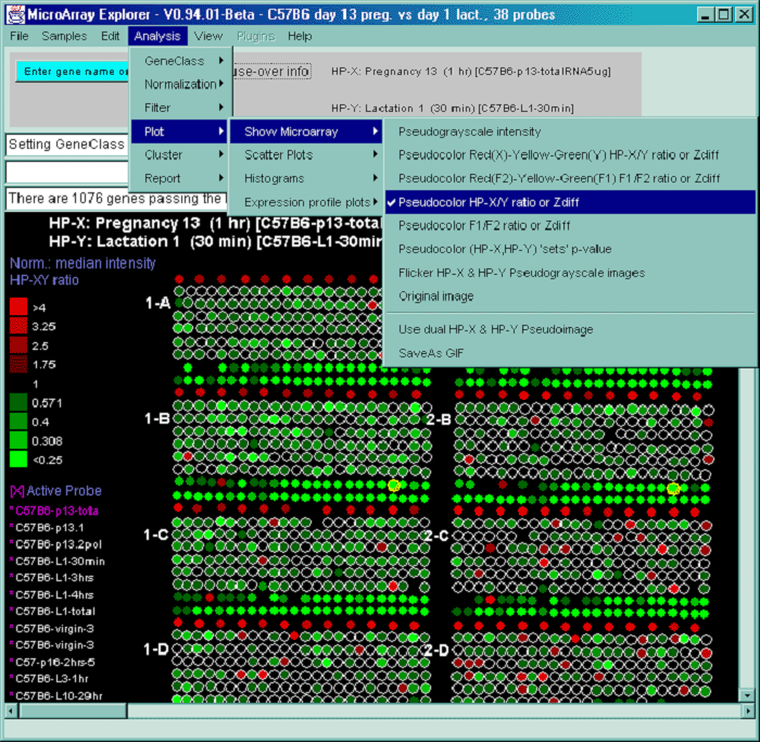
2.4.4.4 Expression profile plots menu
You may generate an individual expression profile plot (EP plot) or a
scrollable list of EP plots. The order list of hybridized samples to
plot are specified by the HP-E set. In the latter case, the genes are
specified by the data Filter.
You many generate as many individual expression profile plots as you
want using the Display a gene's expr. profile for HP-E
command. However, only the last one will be active and will be updated
with different genes as you click on them in the microarray image
scatter plot. This could be used to compare the EP plots for several
different genes. First view the EP plot for one gene, then create a
new EP plot for the second gene, etc.
If you use the Display Filtered genes expr. profiles
for HP-E command, it will generate a scrollable list of
expression profile plots for all of the genes passing the Filter. If
the number of genes is very large, it may take a while.
You may interrogate a line corresponding to a particular HP sample in
a EP plot by moving the mouse over the line and then selecting the
line. This will cause the name of the HP, its intensity and CV to
appear in the plot. If the Err check box is set, then the mean
of the intensity is indicated by a short horizontal bar and the +- CV
by red vertical error bars above and below the mean. If the plot
style Line button is pressed, then the plot style is cycled
between Line (vertical lines for each point), Circle (small circles at
each point), and Curve (circles are connected). Pressing the button
repeatedly cycles through: Line (i.e. vertical vars),
Circle, or Curve (i.e. continuous curve of all
samples). In the case of mean expression profiles
used in K-means clustering, the standard deviation is used in
place of the CV value. The various clustering methods have EP
plots buttons. When they are invoked, the scrollable list of EP
plots is sorted by the clustering method ordered list of genes. This
enables you to view the data in the same order as that produced by the
cluster analysis. If the zoom nnX button is pressed,
then all of the plots are magnified by nn-fold to make low intensity
plots more visible. Pressing the button repeatedly cycles through:
1X, 2X, 5X, 10X and 20X. It does not change the data itself. The
Show HP names button pops up a numbered list of all HP entries
used in the expression profile. If you are in stand-alone mode, a
SaveAs GIF button will also be available for the EP overlay
mode (Figure 2.4.4.4.1) or individual EP plot. This saves the current
plot as a full resolution GIF file specified by the user in a popup
file browser window.
The Expression profile plots submenu contains:
- Display a gene's expr. profile for HP-E - popup a window
and display the expression profile of a gene when click on a
spot in the Image or a point in the scatter plot.
- Display Filtered genes expr. profiles for HP-E -
popup a scrollable montage of expression profiles of the list
of Filtered genes.
- --------------------
 Use EP overlay else EP list [CB] - display Filtered genes
as an overlay plot of expression profiles, else as a scrollable
list of EP plots.
Use EP overlay else EP list [CB] - display Filtered genes
as an overlay plot of expression profiles, else as a scrollable
list of EP plots.
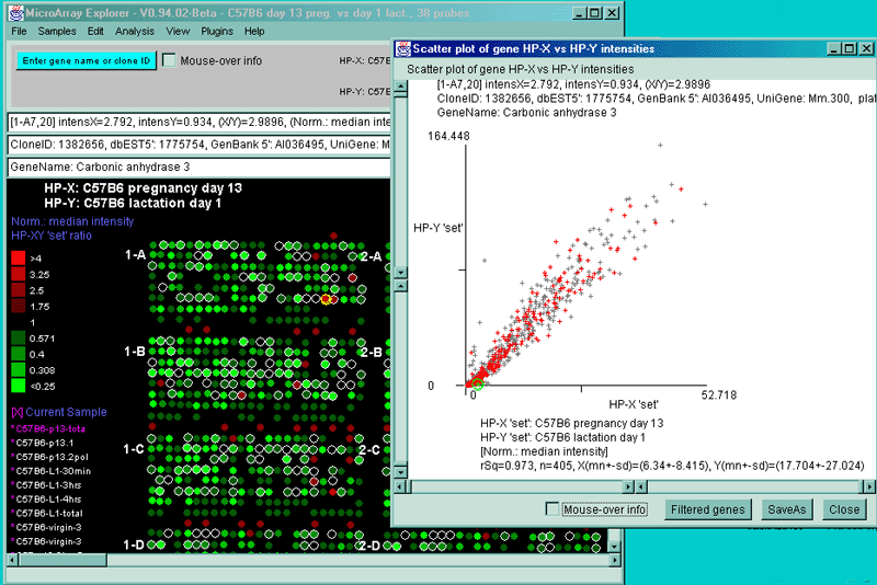
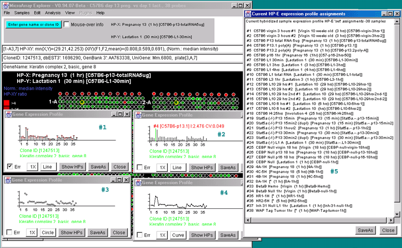
A)

B)

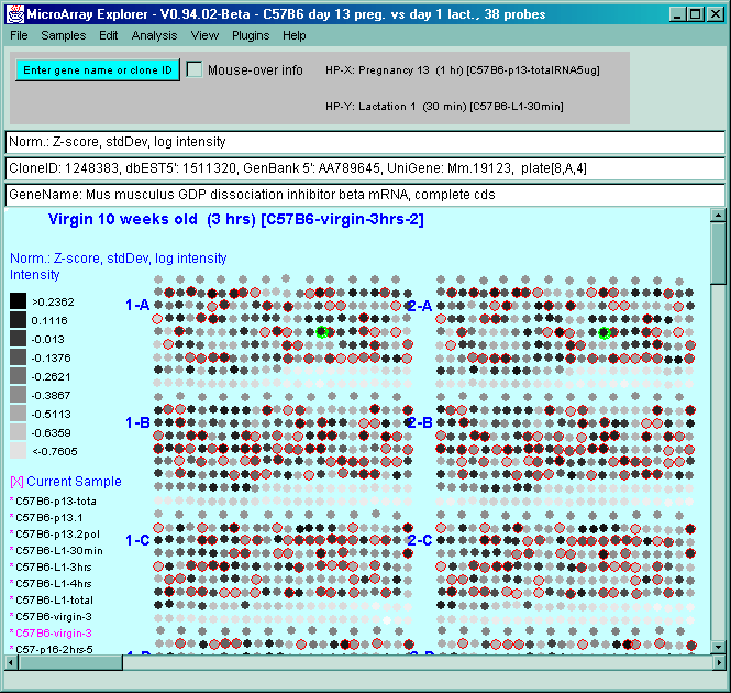
Figure 2.4.4.4 Expression profile plots. A) Individual
expression profile plots may be created by clicking on any
gene. Multiple instances may also be created. Here we show some of the
presentation options for the 38 sample MGAP database. Error bars are
computed for the standard error for that sample. There are three
different plotting options: line, circle and curve. #1 is the default
line plot with error bars. #2 is the line plot without the error bars
but clicking on line 7 to find out which sample it is and what the
intensity value is. #3 is the circle plot with error bars, and #4 is
the curve plot without error bars. Window #5 shows the list of samples
corresponding to the 38 points in the EP plots. B) List of
EPplots of the oncogenes and proto-oncogenes in the database (set by
the guesser with "onco" and "Set E.G.L." and the Edited Gene List
Filter). The list would become scrollable if there were more than 10
profiles. Setting the current gene would scroll the list to the EPplot
for the current gene.
A)

B)

C)

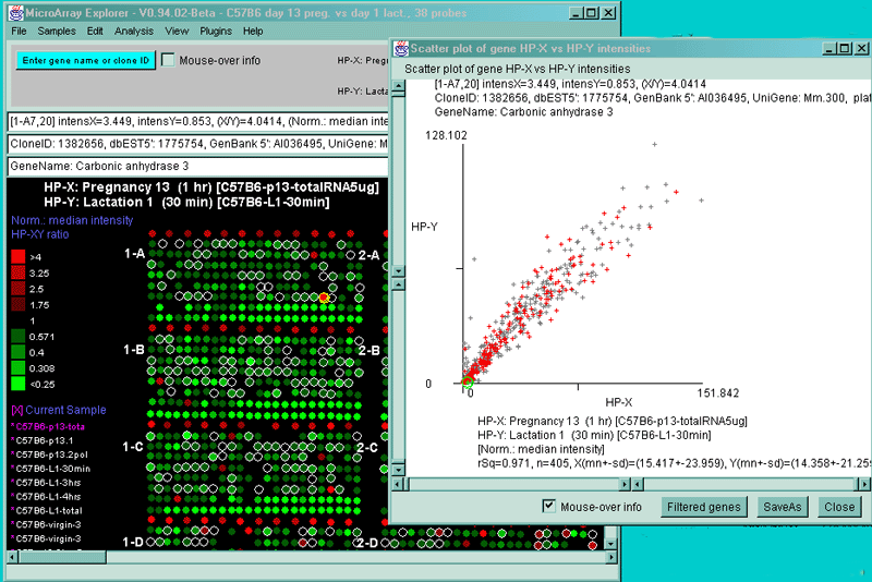
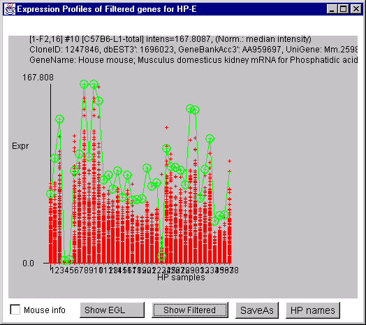
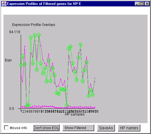
Figure 2.4.4.4.1 Expression profile plots.
A) Scrollable list of EP plots of Filtered named genes centered at
Carbonic anhydrase III.
B) Overlay plot of all named Filtered genes.
C) Overlay plot of all ONCO or PROTO-ONCO genes with the
draw EGL option active so the graphs are drawn for these genes.

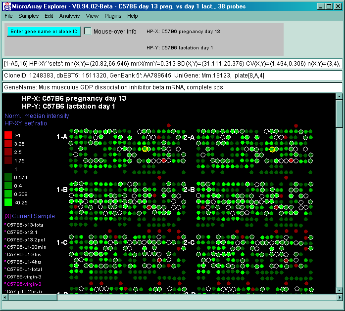
 - display the pseudoarray image
for the current HP sample
- display the pseudoarray image
for the current HP sample